Sonst platzen die – Color Grading
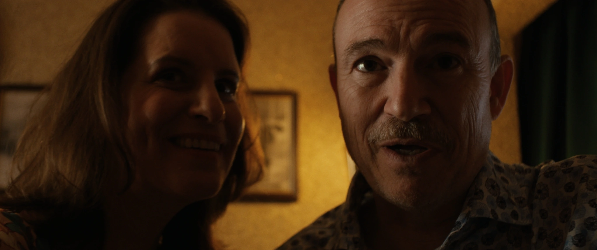
By the time I joined Sonst platzen die, another colorist had already done a first grade. The director and cinematographer had a different look in mind for the film, so they brought me in to regrade it. Stepping into a project at that point feels a little strange at first. It does happen, though, that people have different ideas about where to take a look. We set the first grade aside entirely, went back to the original camera footage and built the grading pipeline and look from scratch.
In our first meeting, director Wiebke Balg, cinematographer Vanessa Mallmann and I went through visual references together. I asked what they liked about each image, and we talked about what we could incorporate into our own look. Overall, we wanted a stronger contrast curve for the film, inspired by the look of a film print.
I’d already had the footage for a while before we spoke, so I’d had time to try a few different looks. Those tests often show me that the look we have in mind and what the footage needs can be two different things. I was glad that the direction we settled on together worked so well with the footage.
Source footage · Sony S-Log3 / S-Gamut3.Cine · Sony XAVC Intra (All-I) · no RAW
The footage had been shot with a different look in mind, and we had no show LUT to build on. In the grade, we tested how far we could push the contrast at the look level before the image started to break. We developed variations of the look for the exteriors and the bathroom. The bathroom scene, for example, ended up looking quite different from what we’d originally planned.
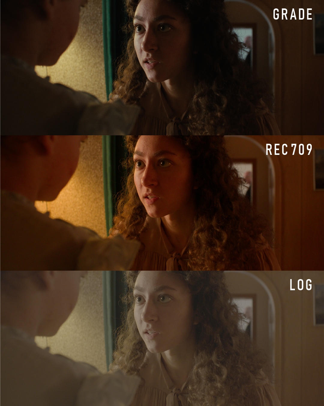
An interior close-up
We wanted to keep the warmth we’d already established for the interiors. In the close-up by the doorway, though, the colors looked too red to us in our Rec.709 reference. We used our interior references to build a variation of the look, with subtle split toning to keep some warmth in the shadows.
Under that look, we adjusted the white balance until the colors felt more natural and the shadows stayed warm. I judge white balance through my grading pipeline so I can see how the adjustment works with the look.
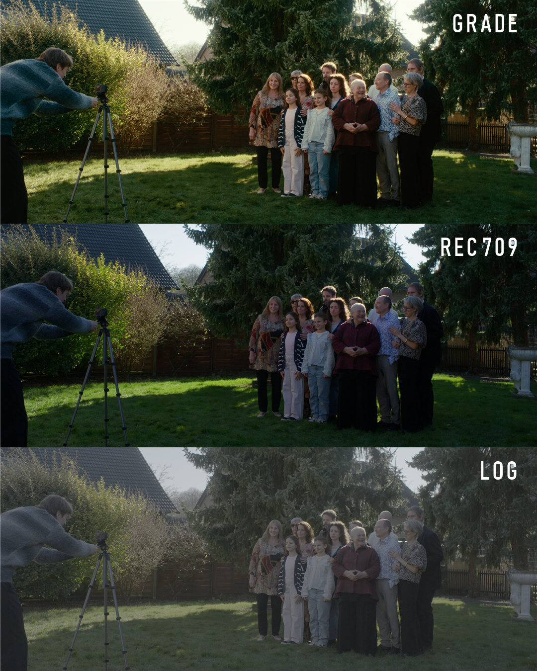
The family photo in the garden
You can see what the look-level contrast curve is doing in the family photo. There’s strong highlight compression, with a smooth roll-off at the top.
For this project I graded in a custom pipeline with picture formation inspired by photochemical film. To my eye, the sunlit grass in our Rec.709 reference looks unnaturally saturated. In the final grade, those greens gradually lose saturation as they approach white. The greens in shadow stay rich. That’s something I like about the way film renders color. Here, it lets the golden backlight catch the eye in the hair and foliage.
I balanced this shot in a working color space modeled on film negative. I could warm the image with offset and keep the hues in the skin, grass and leaves distinct. I liked that separation better than what I got with linear gain.
Alongside the color grade, I handled finishing and DCP creation.
View project gallery