Behind the Look – Passing the Glass
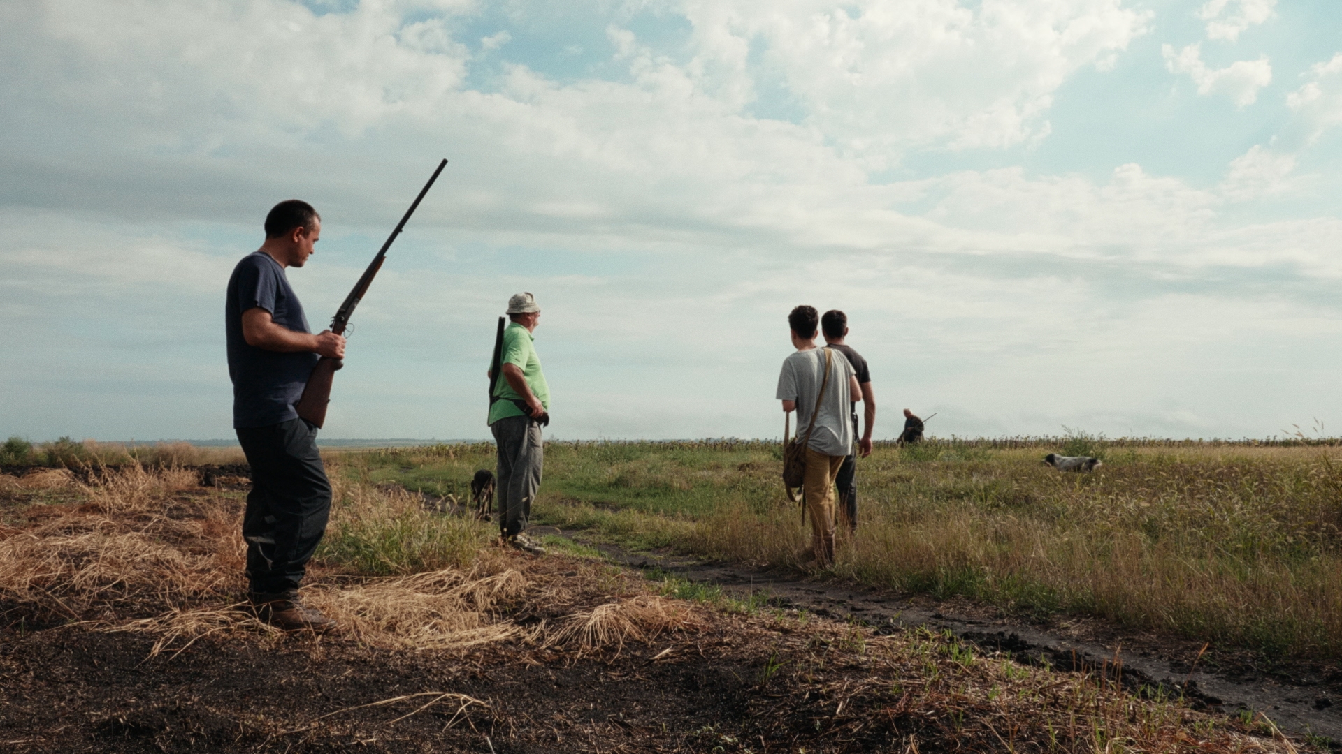
For Passing the Glass, Zauri Matikashvili and I quickly agreed that the two-channel video installation should not have a heavily stylized or overtly cinematic look. Instead, we wanted to stay as close as possible to the memory and emotional reality of the experiences being portrayed. The goal was not to impose a visual style onto the material, but to uncover what was already present within it.
Zauri Matikashvili
Throughout our conversations, we kept returning to the question of how memories are shaped by color. The images we carry with us rarely reflect the exact colors of a real moment. Certain hues, lighting conditions, and fragments remain vivid, while other details fade into the background. These so-called memory colors became an important reference point throughout the grading process.
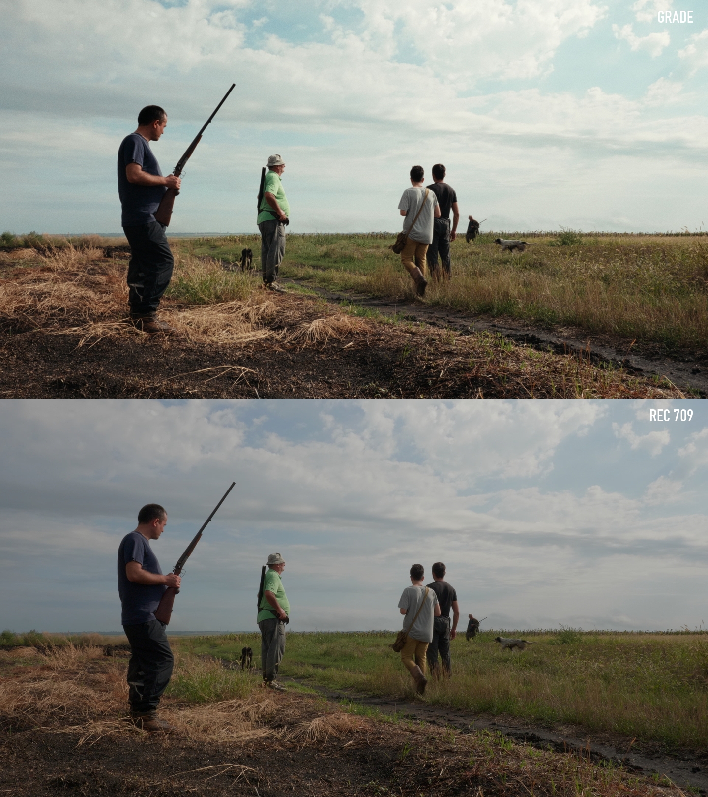
Rather than pursuing a technically precise or purely objective representation of reality, we focused on the colors that felt emotionally connected to the places, rituals, and encounters shown in the work. At the same time, we reduced colors that felt distracting, overly dominant, or artificial, allowing the more meaningful aspects of the image to come forward.
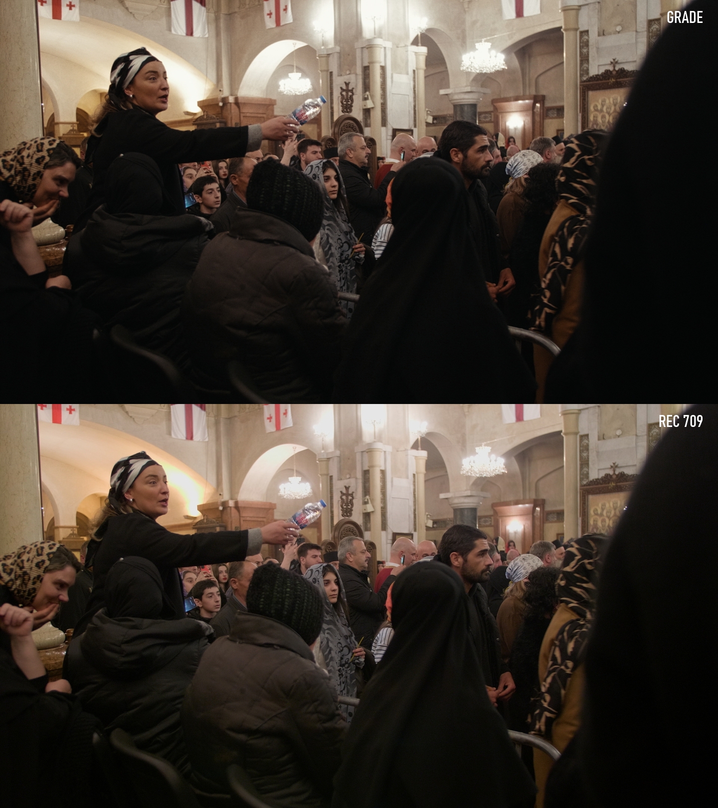
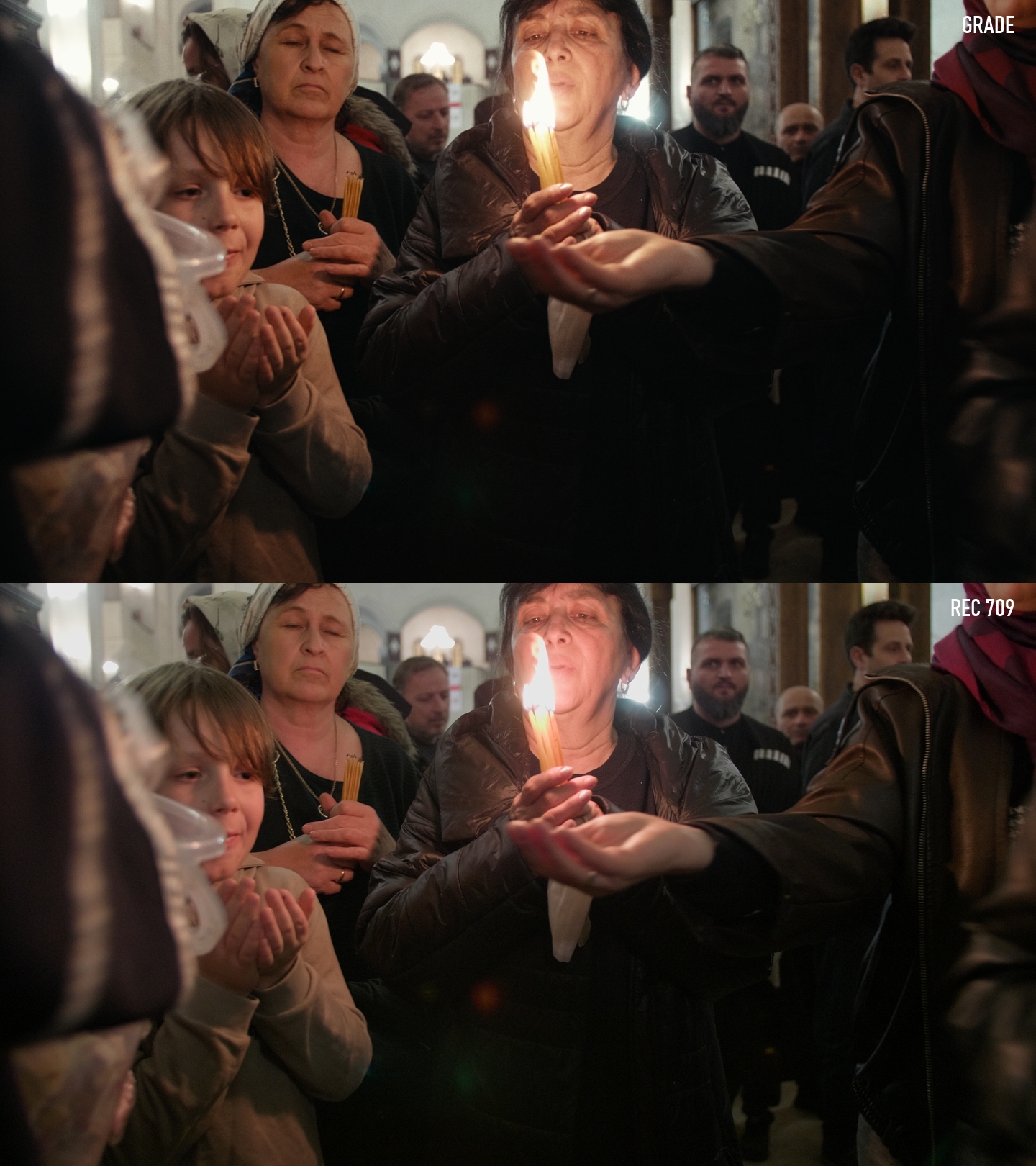
A key part of the grade was softening some of the more digital qualities of the footage. Highly saturated colors and other visual characteristics that drew attention away from the subject were deliberately restrained. This allowed the viewer's focus to shift toward the elements that felt most closely connected to memory and lived experience.
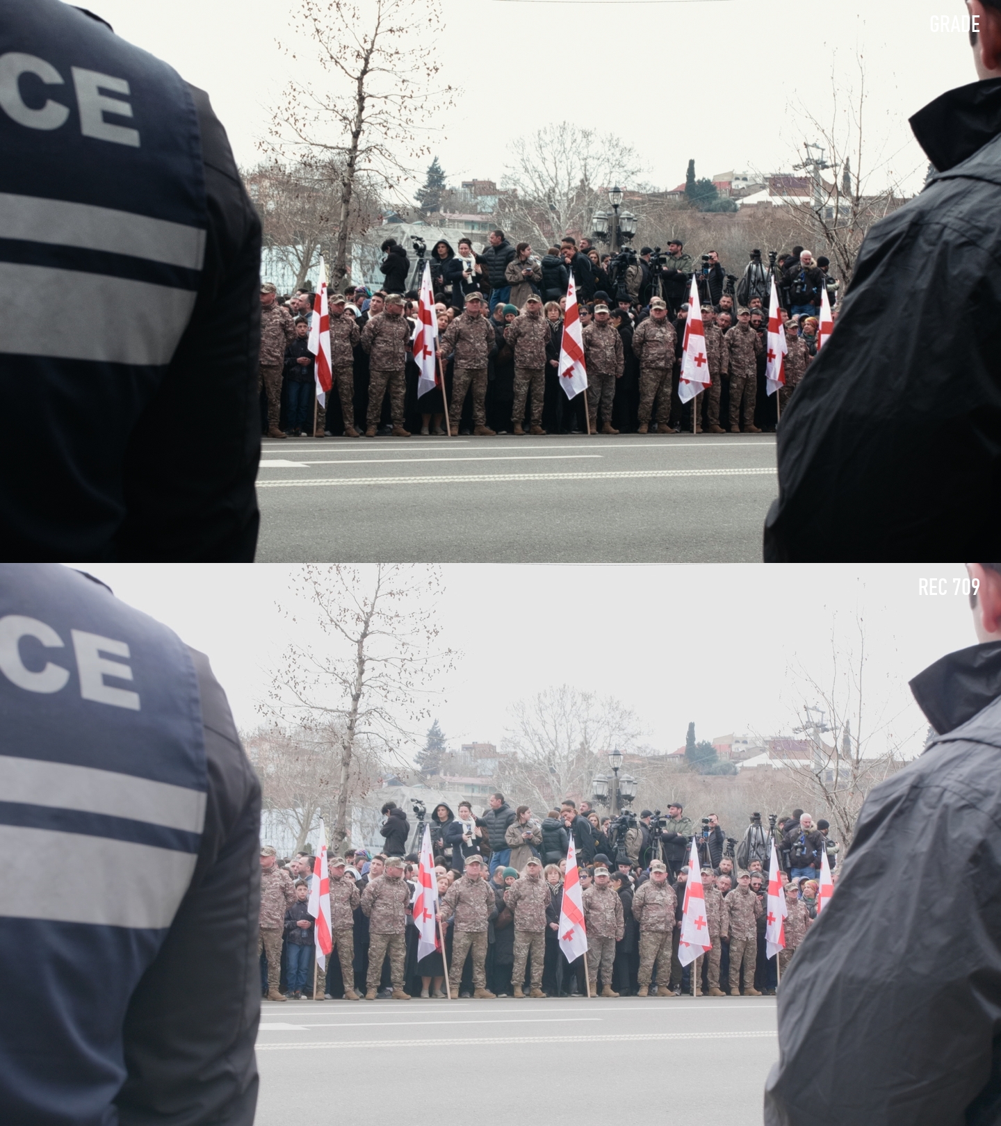
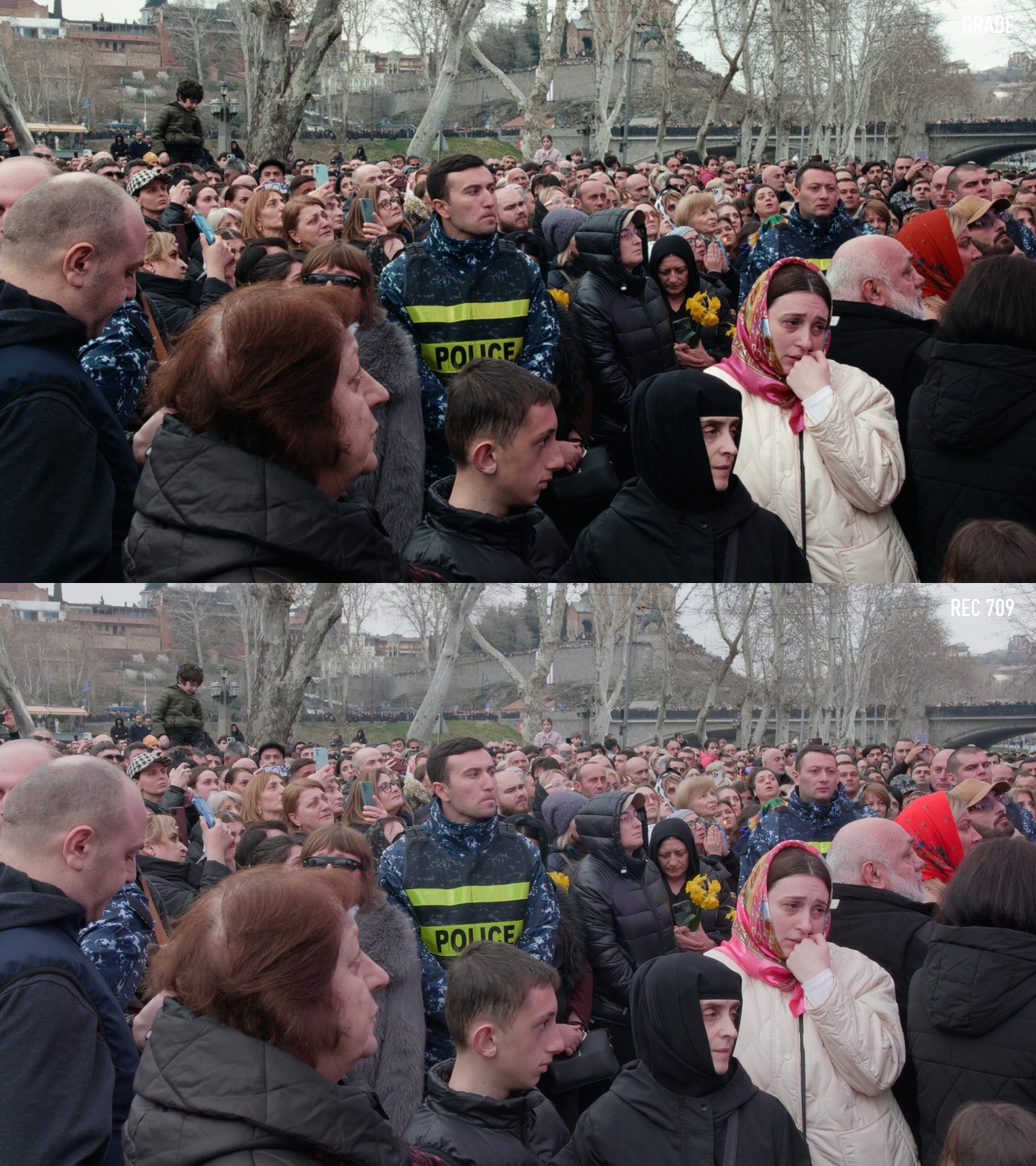
At the same time, we developed a strong contrast structure that gives the images a tangible and physical presence. We wanted the footage to feel grounded and immediate without losing the subtlety of its observational nature. That balance between restraint and contrast ultimately became one of the defining characteristics of the final look.
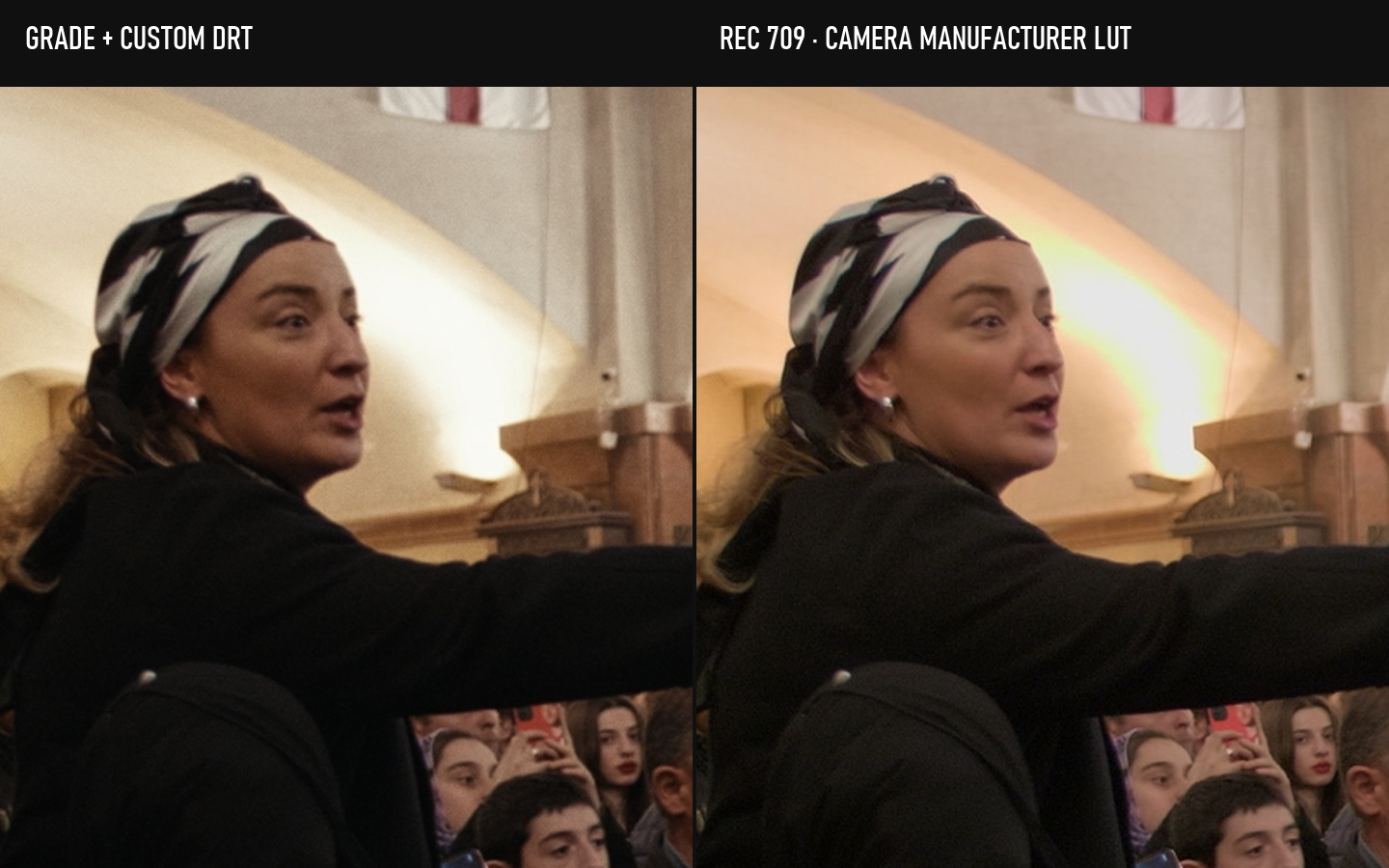
Highlight detail
On the left is the final grade with my custom DRT. On the right is the Rec.709 reference using the camera manufacturer’s LUT. The bright ceiling of the church shows how each version rolls into the highlights.
What I find most interesting about the finished grade is that it feels less concerned with documenting reality than with reflecting how reality is remembered. To me, the images remain honest and direct while still carrying a distinct cinematic quality that supports the emotional tone of the work.
View project gallery