Behind the Look – Quintessentials
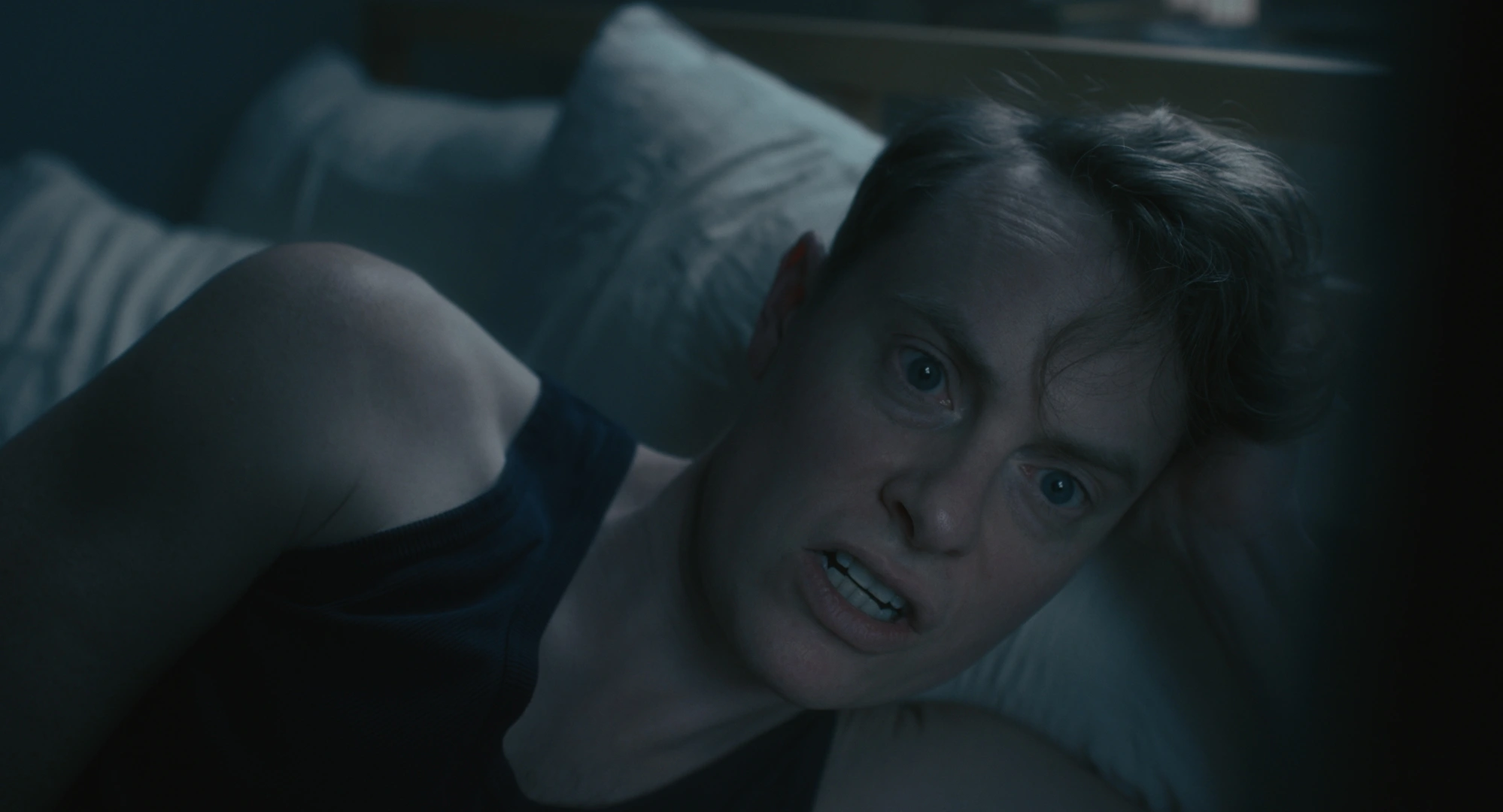
Source footage · Sony VENICE · X-OCN
Working on Quintessentials was especially rewarding because the film's visual identity was developed entirely in post-production. Together with artist and filmmaker Keren Cytter, I developed the final look after the shoot had already wrapped.
The film was produced in the United States with a very small crew, and there were no show LUTs or predefined look references established during production. As a result, the visual language of the film remained completely open when we began working on the grade.
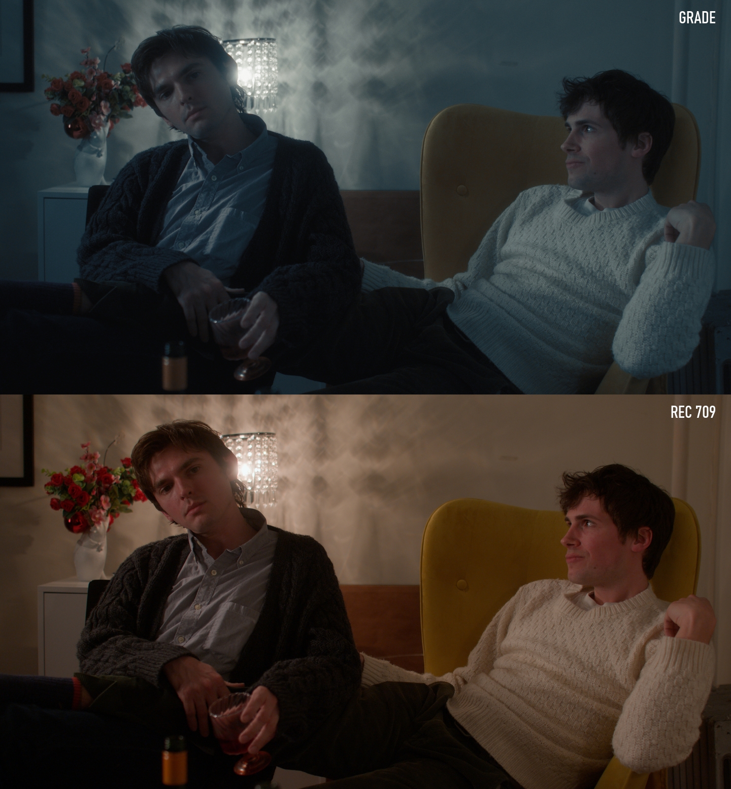
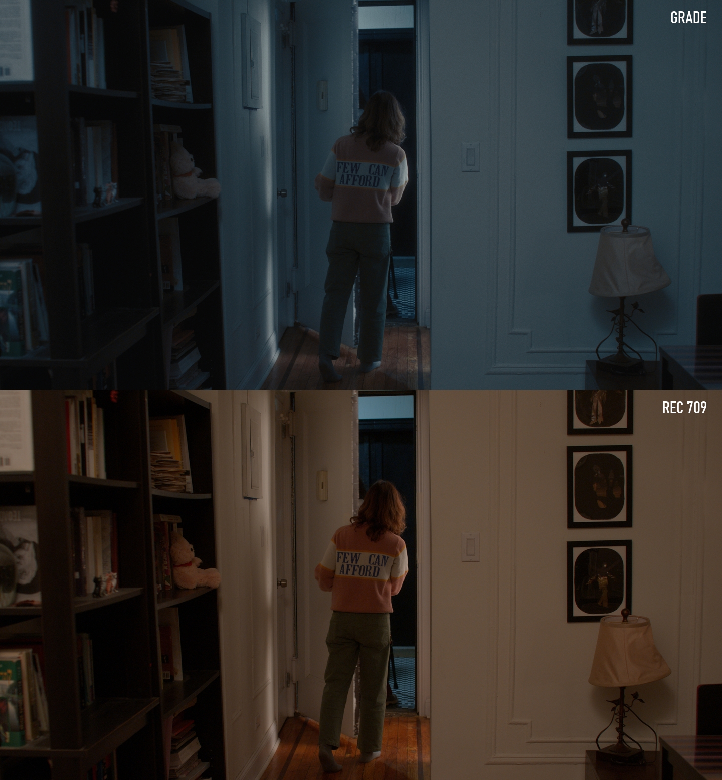
During our first conversations about references and overall direction, it quickly became clear that we wanted to move away from the image we initially saw in the Rec.709 conversion. Keren had a very specific vision for the film. She wanted a low-contrast look with a cool, restrained color palette running consistently throughout the entire piece.
Blue tones play an important role in the final grade, but the goal was never to simply wash the image in blue. We wanted the individual colors to remain perceptible while feeling connected by a common atmosphere. The colors should still be present, just not competing for attention.
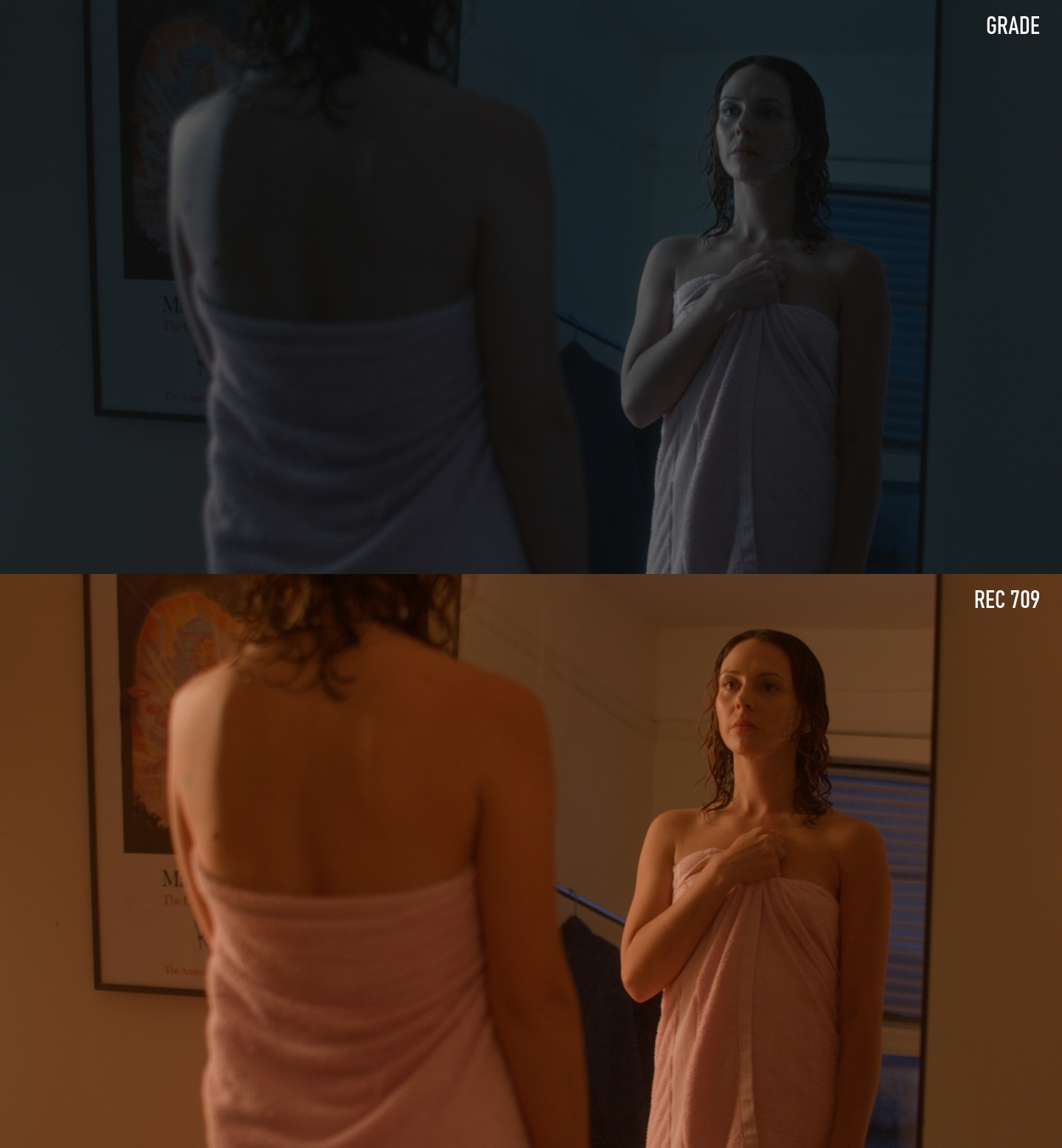
We took a similarly unconventional approach to skin tones. Rather than pursuing a naturalistic or traditionally pleasing rendition, we embraced a cooler and slightly desaturated interpretation. The result reminds me of a hand-tinted black-and-white photograph, where traces of color remain visible but are held together by an overall tonal quality.
From a technical perspective, the look feels somewhat reminiscent of a film scan combined with a bleach bypass aesthetic and a subtle blue offset. At the same time, we were careful to preserve color separation throughout the image. Even though the palette is intentionally restrained, the individual hues continue to exist beneath the surface and contribute to the overall mood.
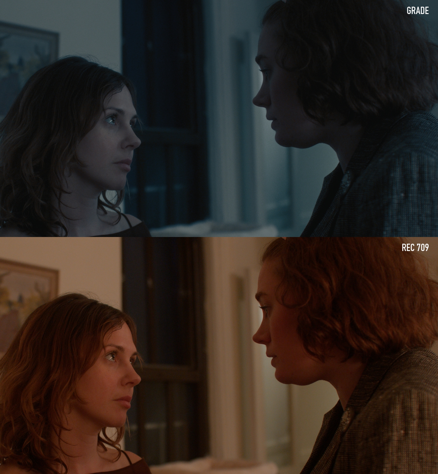
Finding that balance was the most interesting part of the process. The images needed to feel cool and understated without becoming monochromatic or lifeless. Maintaining that subtle color presence while controlling contrast and saturation became one of the defining characteristics of the look.
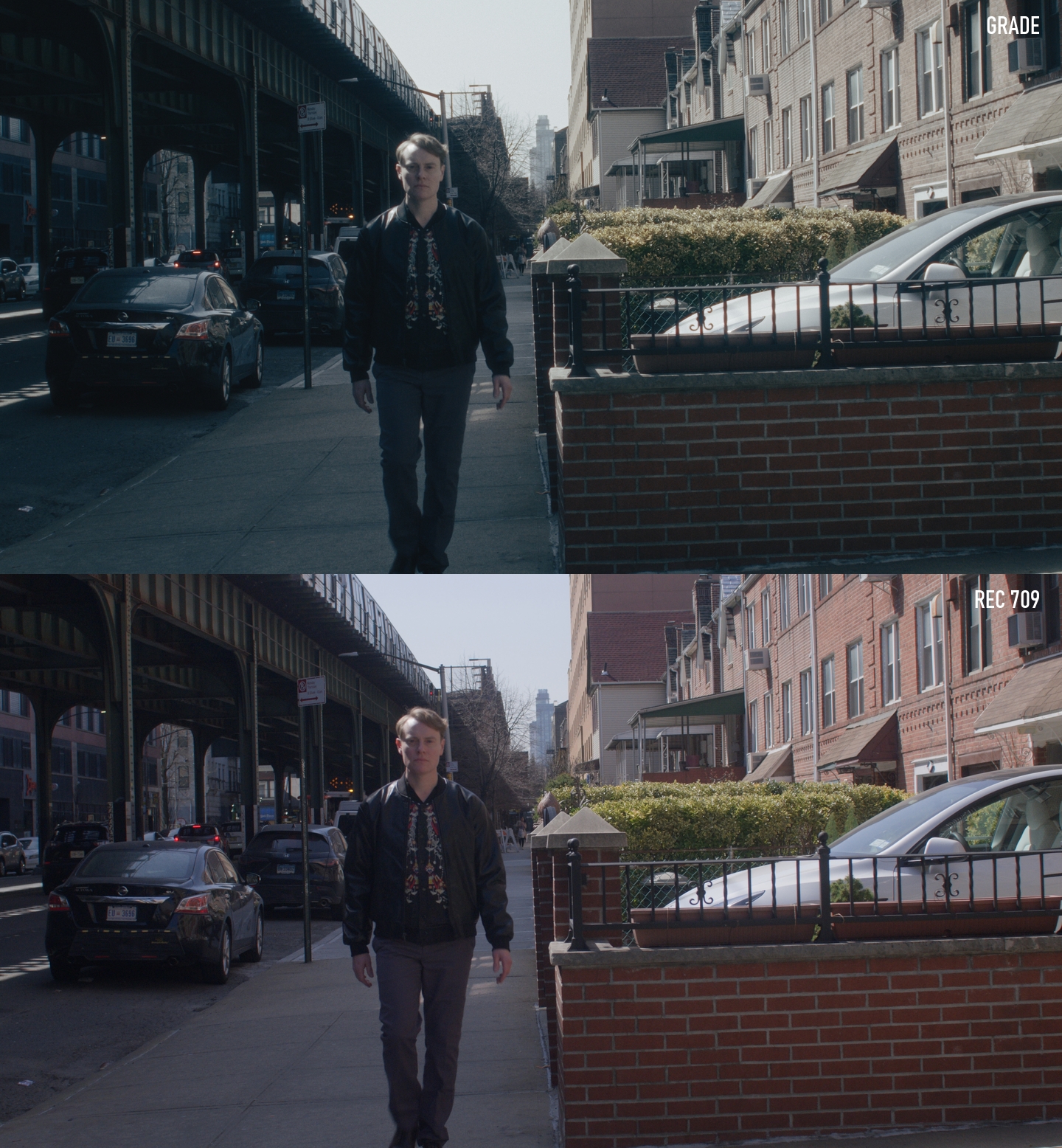
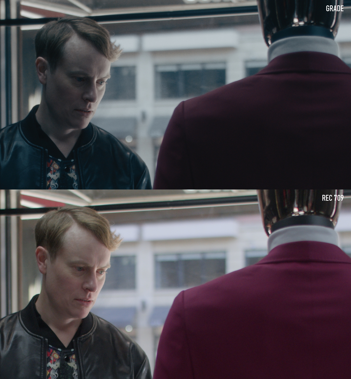
What I found particularly inspiring about this collaboration was that the final direction was quite different from where I would have taken the project on my own. Working through those creative decisions together and fully committing to a visual language outside my own instincts challenged my perspective as a colorist and ultimately made the project far more rewarding.
View project gallery